
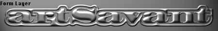
 Tutorial 01: Making 3D Chrome Type
There are several different ways to create 3D type in 2D programs like Photoshop. This particular tutorial will tell you how to create 3D-looking type and a chrome effect with a special advantage that lets you appear to reflect a surrounding environment in the chrome. The walkthrough will also explain the reasons for doing what you do, so that you can use the steps for other ideas. All you need to start is a basic understanding of how to use the software tools. The ones used here happen to be Freehand 3.0 and Photoshop 3.0.
Prepare Your Text
To begin, you could simply open a Photoshop document, create an alpha channel, and type your text. But you will have more control over the image if you create it in a vector drawing program like Freehand. For instance, the rim ringing the letters above could be done in either program, but it's easier in Freehand to delete or combine parts that the automatic capabilities of the program may make too fussy.
If you set the type in a drawing program, remember to convert the type to paths before you export it. Fill the shapes with black. Export your drawing as an Illustrator.eps. Then use your Photoshop program to open it with the Anti-Aliased option selected. For your resolution choose 240 pixels/inch, if you want to print it out or even if you will be using it on the web. (Pixels are similar to, though not exactly the same as, dots per inch.) Set Mode to RGB for web work or CMYK for print work. This layer comes right to the edges of the type. We need a little working room for the special effects. So under Image/Canvas Size add 100 pixels or so in each direction. A little thing to note here is that whenever you have a choice, make your images in sizes that are divisible by 8, since this is the basic unit of images (and just about everything else computerish.)
 It's true that you will only need a resolution of 72 pixels/inch if this is going onto the web. (A monitor is an output device in the same sense that a printer or a fax modem is one. The resolution for a monitor is 72 dpi as opposed to, say, 300 dpi for a printer.) But the effects will work better if initially created at the higher resolution of 240 dpi and then reduced later to 72 dpi for use on the web. On the other hand, loading a 240-dpi document to the web won't make it look better, just very, very big: the 240 dots per inch will try to display themselves on 72 dots per inch and will have to spread over several inches worth of 72-dpi viewing to do it. One final note for web images: you can keep it in RGB if you will be saving the final image in JPEG, otherwise choose Mode/Indexed Color from the menus and save it as a GIF file.
Prepare Your Channels
If you understand the difference between layers and channels, you are ready to set up the three channel masks that will be used to create the chrome effect in the layer image.
The white of the channel is the part that will do the selecting for us and the black not, as shown by the marquee; (the moving dotted outline) when the channel selection is loaded for use.
In the case of a blurry grey area, the same kind of marquee is used to approximate the selection area: it's seems to show a hard edge but the final result will be soft.
Create a new channel. You will get a chance to name it, so let's call it something useful like "Trim," which is what we will use this channel to do.
We want the new channel to have a white background instead of its default black one so that the text will show up. Look at the two squares on the tool palette that indicate the foreground and background colors. Use the little double arrow button to make the background color be white if it isn't already. From the menus, Select/All of the new channel and delete to fill it with white. This is a good time to save your document. If you don't want to overwrite your eps format file, make sure that your change the name this first time when you are given the option.
Back in the Layers Palette, select all (if its not still selected) and cut your type from its layer. Then in the Channels Palette, activate the "Trim" channel by clicking on it and paste the type into your new "Trim." channel. Deselect the text by clicking outside of the marquee. Save your document.

We need to a copy of this channel for the next step. Simply drag the channel name onto the middle icon at the bottom (it looks like a page). Double click on the name of the new channel so that you can rename it "Form." Save.
Now let's change the "Form: channel back to its default black background. Select all, go to Image/Map in the menus and choose Invert to reverse black for white.
With everything still selected, in the "Form" channel choose Filter/Blur/Gaussian Blur from the menu and enter a Radius of 10 pixels. Click Okay. (The image in the tutorial examples was 2000 pixels by 288; if your image is smaller or larger, you may want to modify the blurring radius accordingly.)

Next, we will use the "Trim" channel on the "Form" channel. With the "Form" channel active, drag the "Trim" channel onto the left icon at the bottom of the channel palatte (the icon with a dotted circle inside a square). This will load the "Trim" selection. We want to fill this selected area with black. If white is the background color and black is on top, use the little arrows to exchange the colors and then delete. Save.

Holding the option (alt) key while hitting delete fills the layer with the foreground color instead of the background color. This is especially useful in the case of layers, when you have a transparent layer with no solid color in the background and want to fill it. Just hitting delete alone won't fill the transparency with the background color in a transparent layer.
For the final channel, make a copy of the "Form" channel as you did above and name it "Shade." Select/All and apply the Gaussian Blur again.
Check to see that your background color is black; change if necessary. Then, use your right and down keyboard arrows to move it: about 10 clicks right and 5 down. (Maybe less or more depending on the room you have around the image and size.) You could use the same number of strokes in each direction, but things aren't usually symmetrical in real life.
Load the "Trim" channel as a selection. This time, we really want the opposite of what is normally selected, so choose Select/Inverse from the menu. Then delete to fill with black. You can now deselect by choosing Select/None from the menus. Save.

Let's Make a Texture. Not.
We're almost ready to begin applying layers. For the first layer, we need a texture image. This is like the bump maps used in 3D illustrations to imitate the third dimension. The black areas are treated as depth and the white areas as height. To make the texture map would normally require creating a separate image. But instead of doing all that, we will be able to use the channels as bump maps in the lighting effects options. So this step is very easy. You're all done, and you've learned a little about bump maps.
Prepare Your Layers
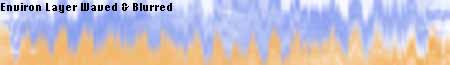
Switch from the Channels Palette to the Layers Palette. In the Layers Palette, rename the layer "Form." This will make it easier to follow along later. Create a new layer above this and call it "Shade." The final top layer is the "Environs" one. After we do some work on these layers, you will combine them to create all the features that chrome displays.
To prepare the first layer, "Form," activate it by clicking on its name and Select/All. Then from the menus choose Edit/Fill. Select 50% Grey for Use, 100% for Opacity, and Normal for Mode. Click Okay.
Experiment! Try filling the background with a green- or a blue-grey.
From the menus choose Filters/Render/Lighting Effects. Pick a Spotlight, rotate it to the top of the image, and adjust it so that the light fills the upper portion of the image without being too bright. Make the Gloss shiny, the Material, metallic. For the Texture Channel option, choose your "Form" channel. (You can also lower the spotlight's Intensity for a softer satin finish like brushed metal.) Viola! Instant 3D chrome type. Now we will add some shadows and the reflections of the environment.
To make a drop shadow to help define the letters, load the "Shade" selection in the Channels Palette and then activate the "Shade" layer in the Layers Palette. From the menus choose Edit/Fill. Select Black for Use, 100% for Opacity, and Normal for Mode. Click outside the selection to deselect and save your work so far.

For the "Environs" layer, choose Edit/Fill from the menu. Select White for Use, 100% for Opacity, and Normal for Mode. Don't be scared if everything disappears. It's just hiding. Besides, you have been saving as we go along, so you're safe. (If you have chosen by default to create new documents with a white, rather than a transparent, background, you will already be ready here. The tutorial has been tested both ways.)
Double click on the Foreground color box to pick a nice sky blue. Use the airbrush to paint in a sky on the layer, leaving some white spots for clouds. Now choose a light tan shade and paint in the earth. Leave about half the space white between sky and earth. Save your work. This will be enough for a good layer, but you could add some pink to the sky for a sunrise or some green to the earth for trees. (You could also paste a picture on this layer if you wanted.)
For some variant environ options, see Tutorial 02.
From the menus choose Filter/Distort/Wave and choose Square for the Type option. Then give it a Gaussian Blur with a radius of 5.
Load the "Trim" channel selection. Hit delete. Deselect.
Layer the Layers
We're ready for some final adjustments. Let's start with the "Shade" layer in the Layers Palette. Activate this layer and change the palette's little pull-down menu from Normal to Multiply. Adjust the Opacity until you think it looks good. In the example it's set at 90%. The Multiply state adds the shadow's darkness to the "Form" layer's darkness.
Next, make the "Environs" layer active and choose Overlay. Adjust the Opacity to your taste. In the example, the setting is 50%. Notice the difference between using the Overlay state here instead of the Color state.
When you have everything as you like it, File/Save the document. Then File/Save A Copy, with these options selected: Flatten Image and Don't Include Alpha Channels. Save your copy as a TIF documents using LZW compression. Now it's time for the icing on the cake. Close your original document and open the copy.
And Ice the Cake
From the menus, choose Filter/Render/Lens Flare. Position the flare by moving the crosshairs. The final example uses the 105 mm Prime Lens Type at a Brightness of 40%.

Now you can print to a color printer or send to a service bureau for film. If you want to use the image on the web, then choose from the menu Image/Image Size, and change the dpi to 72; make sure the measuring units are in something other than Pixels.
What is Next Month's Tutorial? 
 Ready to go back to 3D Tips and Images?
How about a look at images made with a 3D program?
*This page and its pictures ©1998 artSavant.